Teapigs fruit fusions boxes
The brief for this project was to redesign the Teapigs packaging, with a focus on quality, sustainability, and an element of fun.
The current Teapigs packaging lacks in a few areas. While the tea itself uses high quality ‘real’ ingredients, this luxury feel could be brought into the packaging a lot more.
On the sustainability angle, Teapigs are a certified B-Corp company which isn’t spoken about at all on the packaging. The packaging does use sustainable cardboard and goes into depth about how to recycle the different parts.
Teapigs do present themselves as fun and informal through their words and tone of voice, but this is not carried through into the packaging.

Current packaging
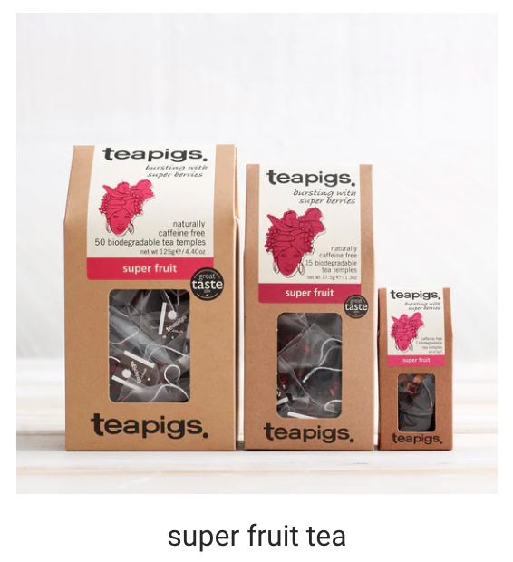
Current packaging
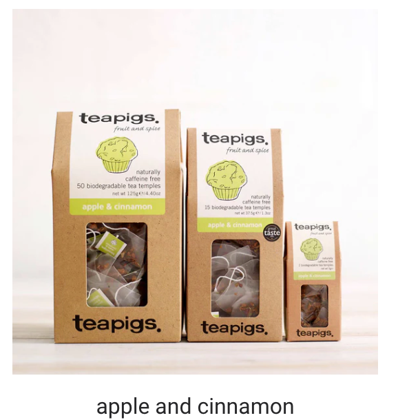
Current packaging
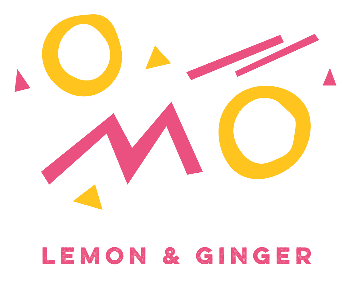
Abstract representation of lemon and ginger

Abstract representation of lemon and ginger

Explanation of shapes
The shapes are abstract representations of the flavour and ingredients in the tea. This approach answers best to the fun part of the brief. It can also be directed towards a younger audience of tea drinking, and excites them with unique packaging (compared to the rest of the tea genre).
The typeface which has been used is Novecento Slab; which has a high-end feel without carrying the traditional connotations that most serif typefaces have. It’s fine and delicate while still being modern.
The illustration is zoomed in to focus on the composition's energy and movement.
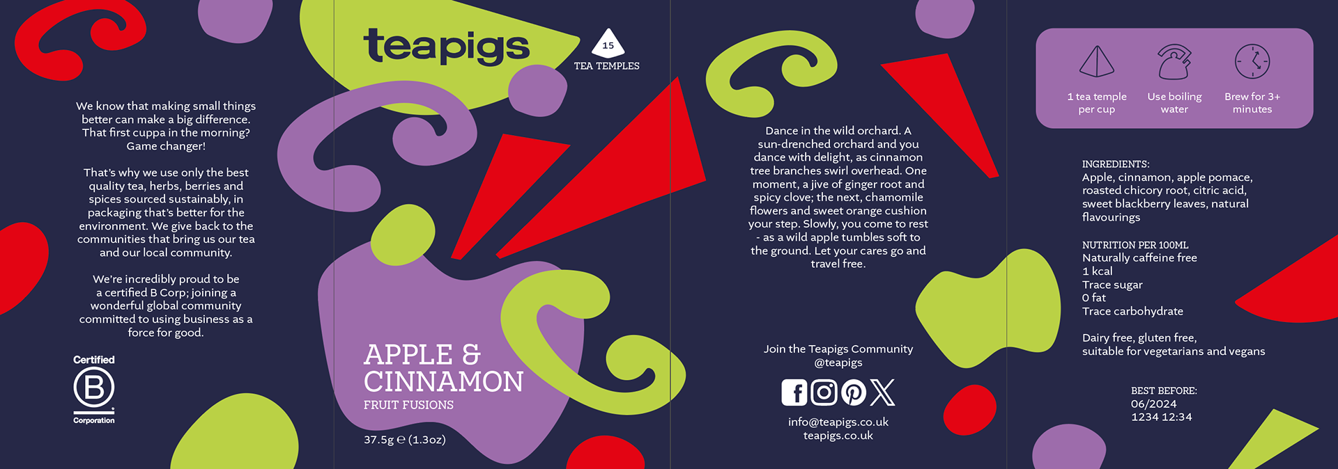
Apple & Cinnamon packaging
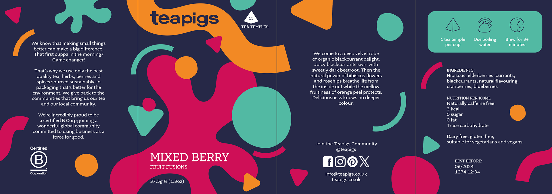
Mixed Berry packaging
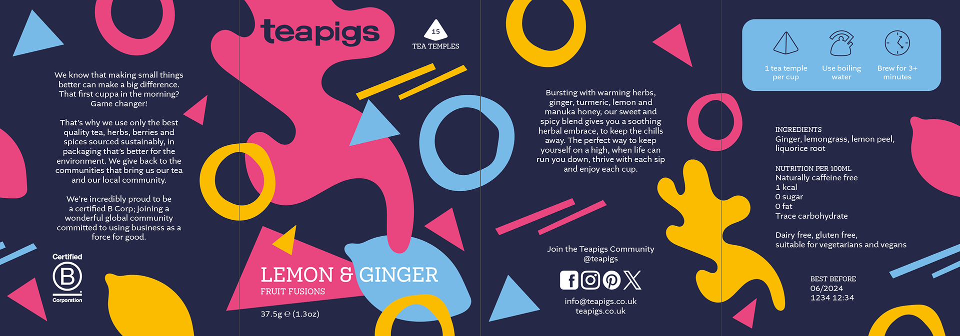
Lemon & Ginger packaging
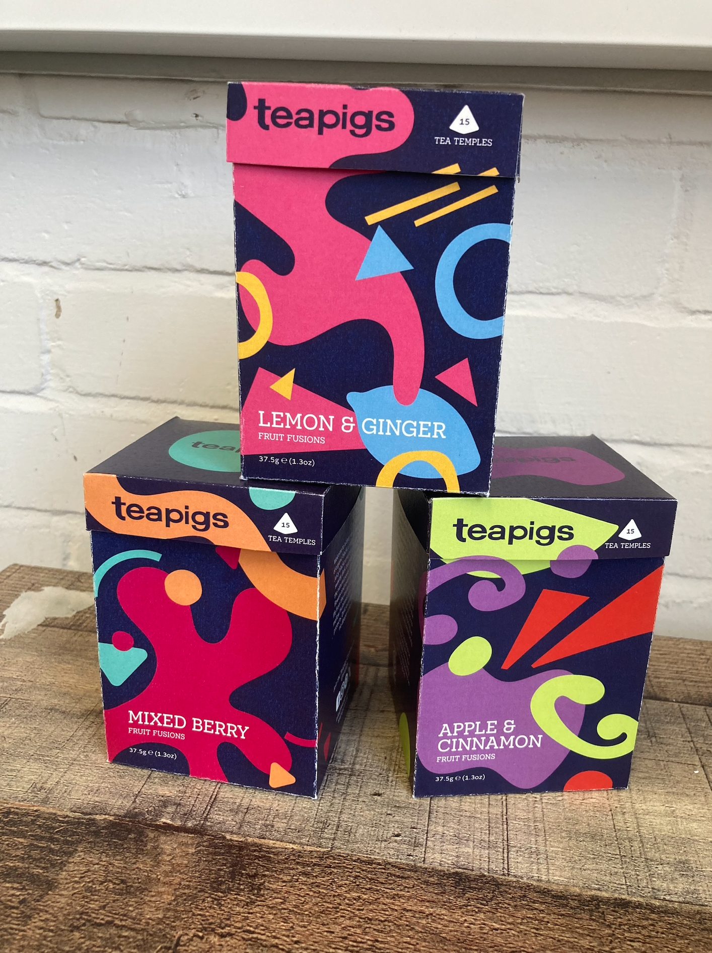
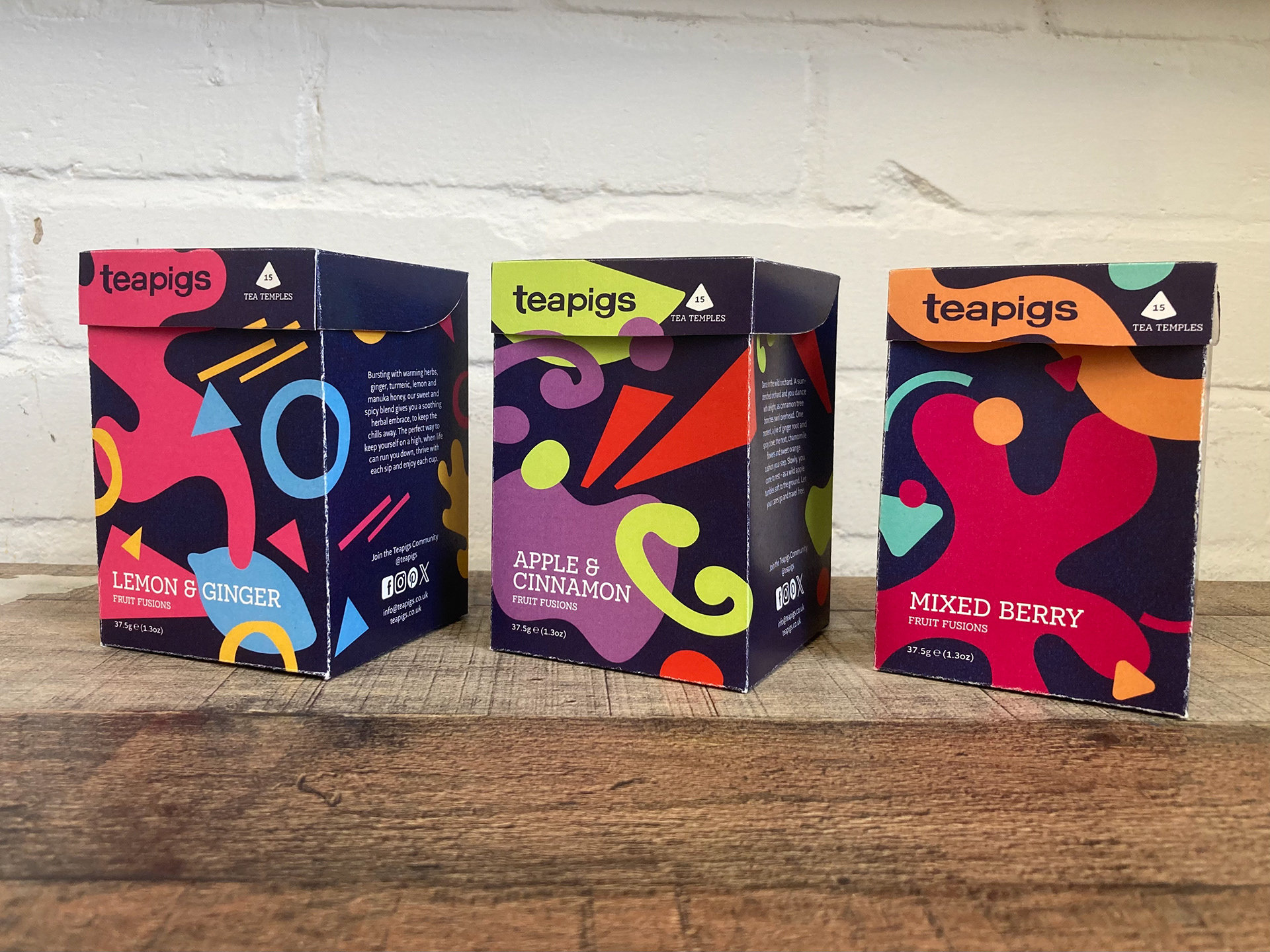
Printed tea boxes
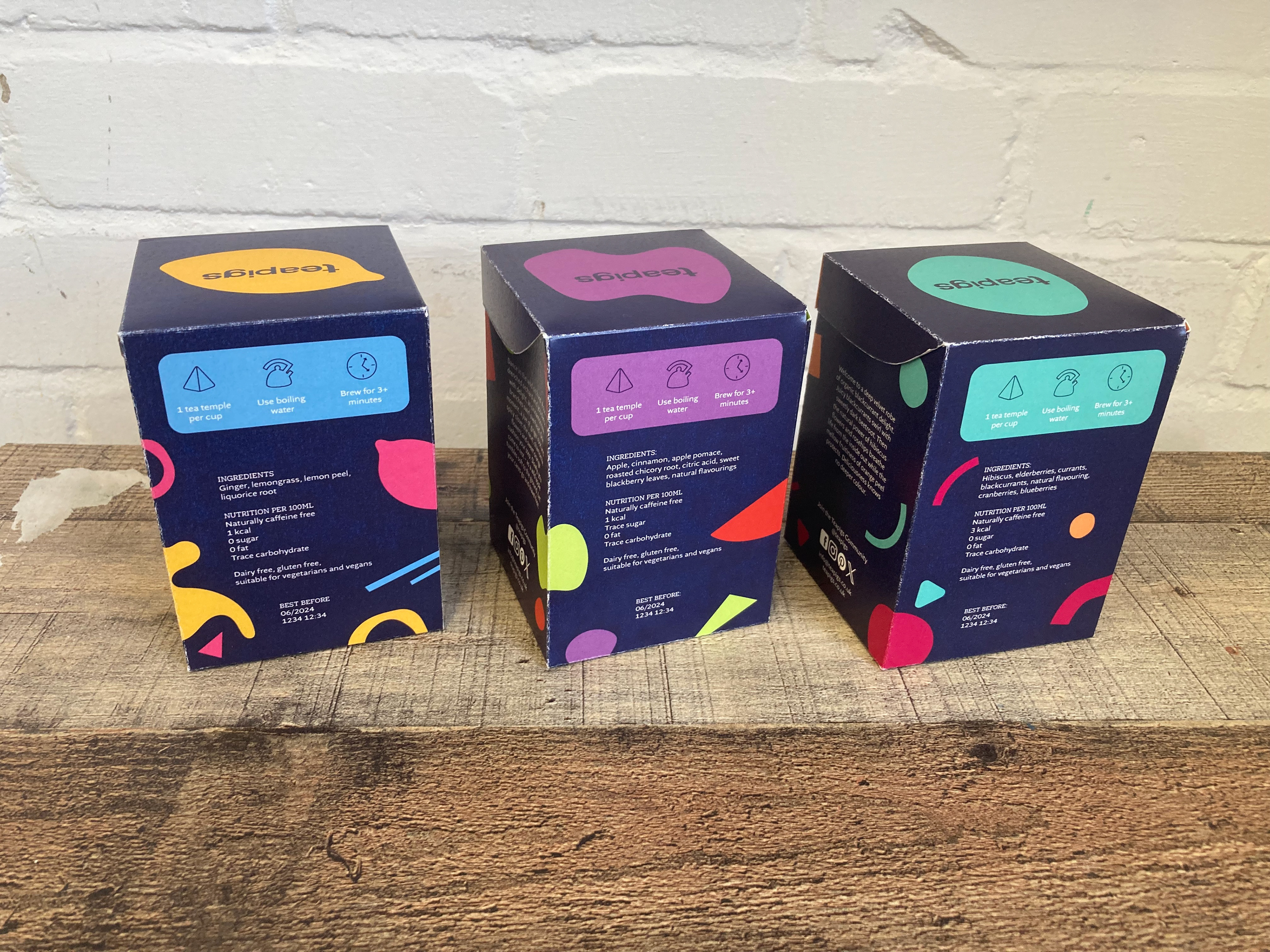
Backs of the tea boxes
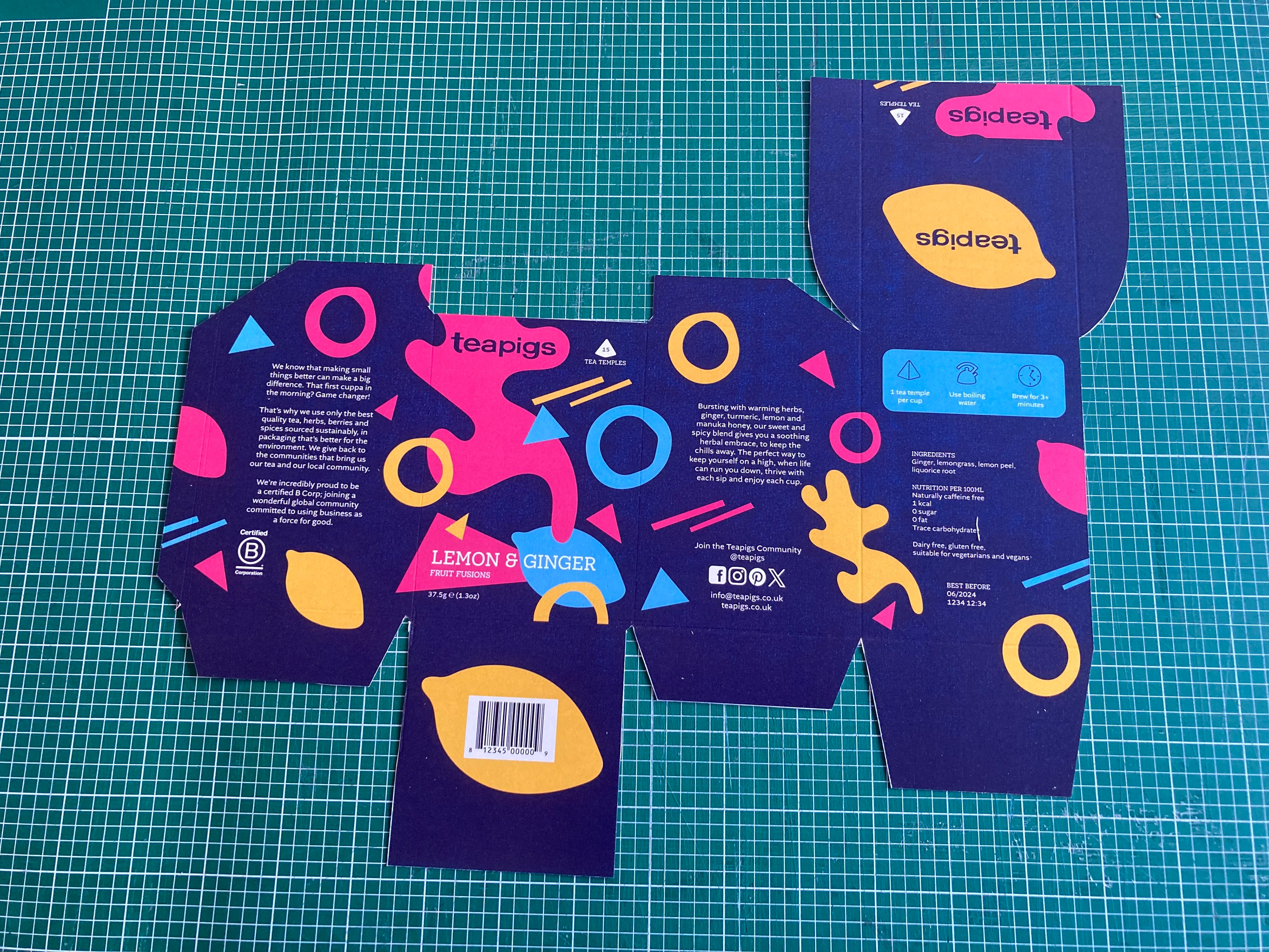
Printed net for the tea boxes
The finished tea boxes have the pattern wrapping around the box, as well as the information required on food packaging. Each flavour is distinct in its own colours and shapes, while still working as part of the larger set.


